Rebuilding TallyScan: a field tool that had grown four versions past coherent.
A ground-up UX rebuild of TallyScan, the primary Android field tool cargo handlers use at Wallenius Wilhelmsen (WalWil) terminal operations — offline-first, one-handed, and used under real physical and time pressure. Led from heuristic audit through gap analysis through object modeling through redesigned concept.
Nobody could tell if their work had actually gone through.
Wallenius Wilhelmsen is a market leader in roll-on/roll-off (RoRo) shipping and vehicle logistics, managing the distribution of cars, trucks, rolling equipment, and breakbulk worldwide — around 125 vessels servicing 15 trade routes across six continents, a global inland distribution network, 66 processing centers, and 8 marine terminals. TallyScan is the primary tool cargo handlers use to receive, load, discharge, deliver, and stage cargo at those terminals — offline-first, on Android, in low-connectivity physical environments that demand one-handed, glanceable use. It had accumulated four design versions over time, each adding functionality without a coherent system behind it.
The core operational failure: handlers working offline had no reliable way to know whether an action had synced, was queued, or had failed. That created anxiety and double-work on every single shift.
Design had to hold up in the yard, not just in Figma.
Offline-first sync behavior, Android-only field devices, one-handed and interruption-tolerant interaction patterns, a cargo and event taxonomy still being defined in parallel with the UX work, and a fixed September 2026 GIART pilot deadline that forced hard scope calls — Measure & Print, for example, was explicitly deferred to backlog.
Scope is land-side only — logistics services cover anything done to cargo before and after shipping; what happens on the vessel itself is out of scope. Cargo falls into two types: Auto, and High & Heavy (H&H) — cargo too tall or too heavy for certain bridges, tunnels, or roads.
Empathy → Define → Ideate → Prototype → Test & iterate.
Empathy
Audited all four generations of the existing app against all 10 Nielsen heuristics, on the actual rugged hardware, before proposing a single change.
Define
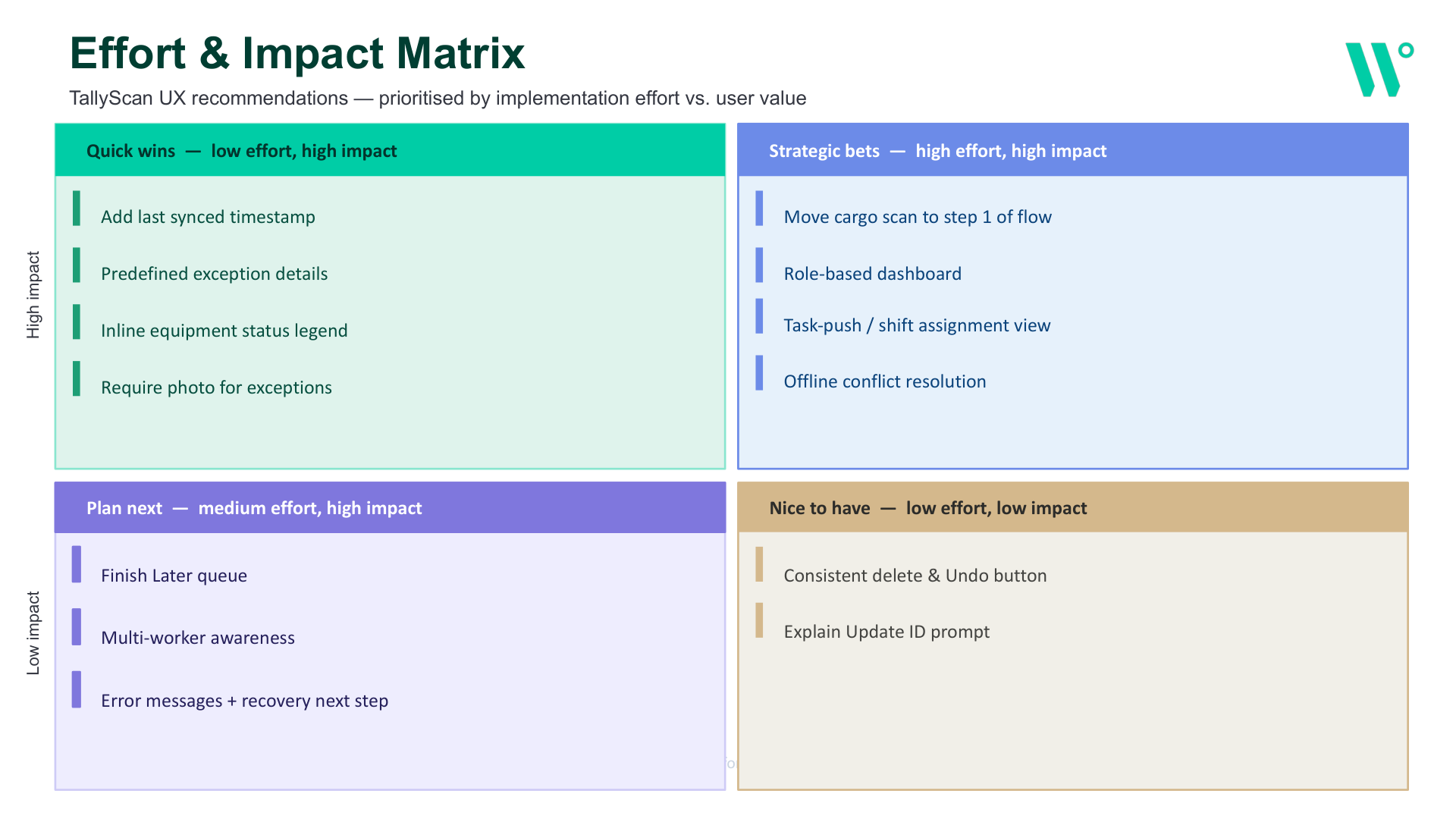
Synthesized the audit into 5 structural gaps and an effort/impact matrix — and was explicit about what got deferred, and why.
Ideate
Diverged into three IA options around different mental models with the stakeholder team, then converged on one — and mapped the object model behind it.
Prototype
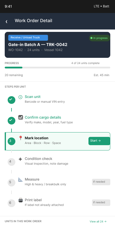
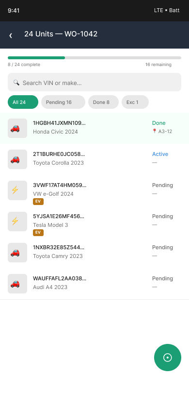
Built a working concept addressing the audit's top findings directly — sync status, condition capture, location capture — sequenced by pilot priority.
Test & iterate
The IA itself went through three full versions against real taxonomy and workflow changes, driven by the client team, not just internal review.
Understand the problem before designing anything.
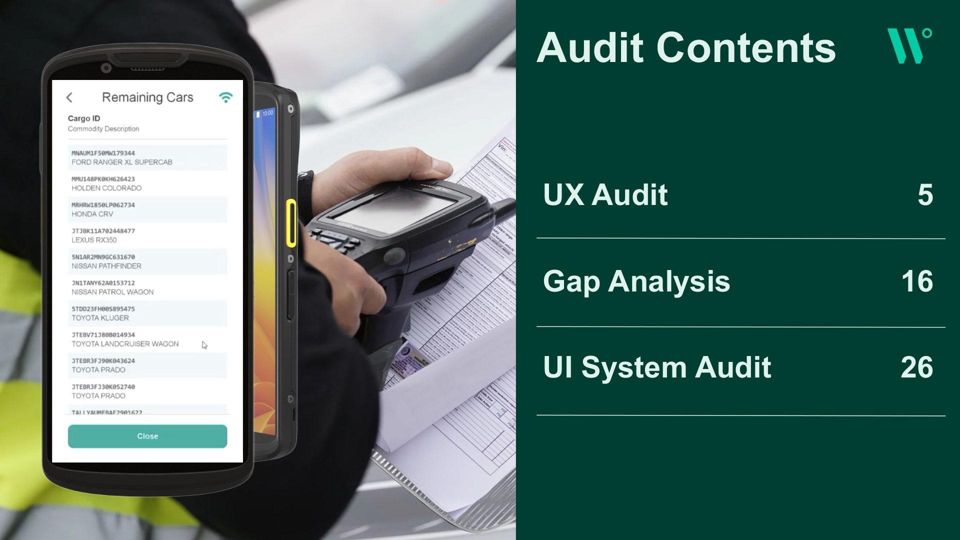
TallyScan runs on rugged handheld Android scanners in outdoor yard conditions — the audit had to account for gloved hands, glare, and interrupted connectivity, not just screen-by-screen usability. Every screen across all four app generations was scored against all 10 Nielsen heuristics before a single change was proposed.
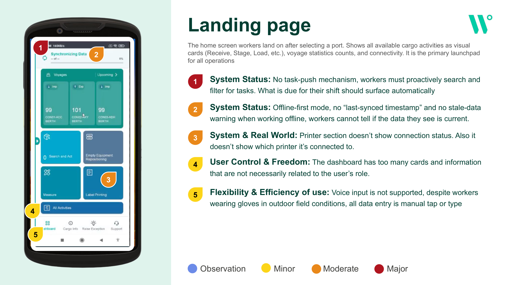
Landing page
- No task-push: workers must proactively search and filter for tasks instead of having their shift surface automatically.
- No sync status: offline-first with no "last synced" timestamp and no stale-data warning.
- Dashboard overload: too many cards unrelated to the worker's actual role.
- No voice input despite workers wearing gloves in outdoor field conditions.
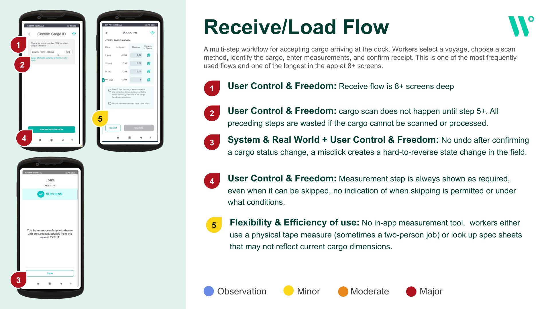
Receive / Load flow
- 8+ screens deep for one of the most frequent flows in the app.
- Scan happens at step 5+ — every preceding step is wasted if the cargo can't be processed.
- No undo after confirming a status change — a misclick creates a hard-to-reverse state change in the field.
- No in-app measurement tool — workers use a physical tape measure, sometimes a two-person job.
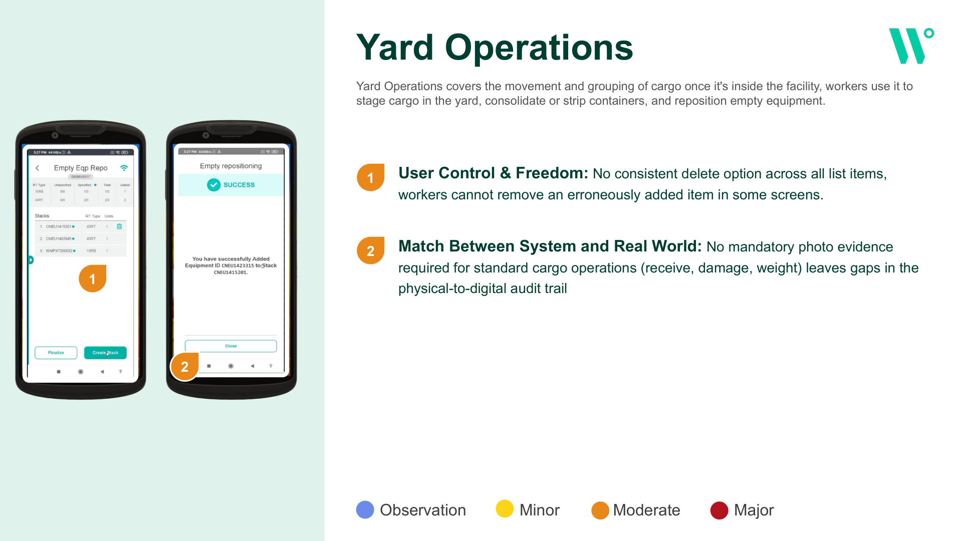
Yard operations
- Inconsistent delete: no consistent way to remove an erroneously added item across all list screens.
- No mandatory photo evidence for standard cargo operations, leaving gaps in the physical-to-digital audit trail.
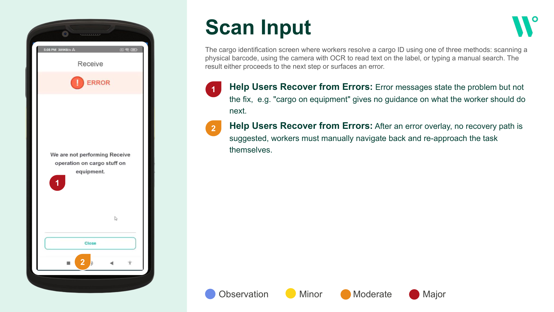
Scan input
- Errors state the problem but not the fix — e.g. "cargo on equipment" gives no guidance on what to do next.
- No recovery path after an error overlay — workers must manually navigate back and re-approach the task.
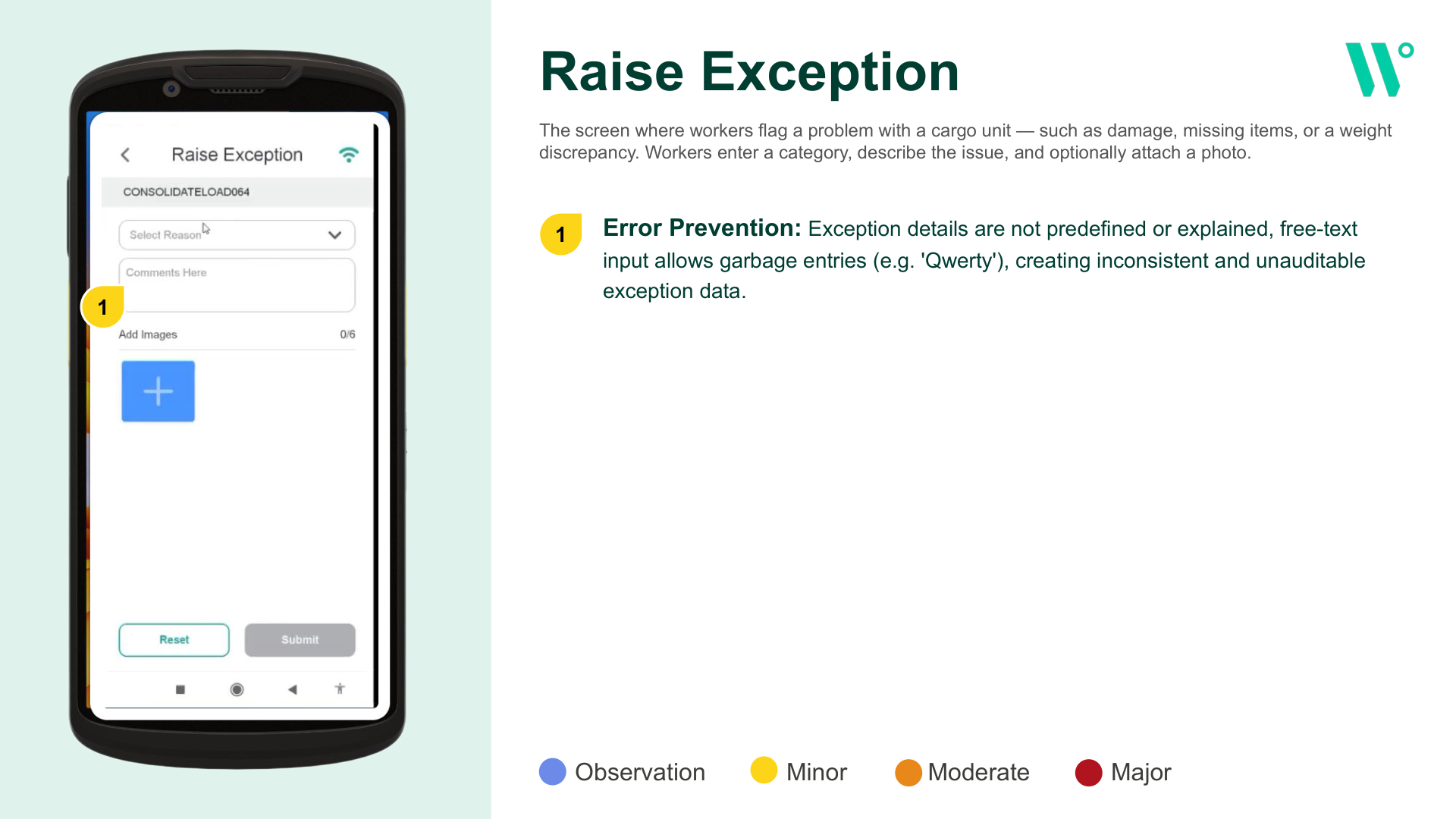
Raise exception
- Free-text, unexplained fields allow garbage entries (e.g. "Qwerty"), producing inconsistent, unauditable exception data.
From a shipping-first app to a cargo-first app.
The audit's findings were synthesized into 5 structural gaps, each with a stated recommendation, then prioritized against every other recommendation by implementation effort vs. user value.
Workorder support
Technical services are core to the operating model, but aren't represented in the app workers carry.
Condition & location capture
No step asks for cargo condition; the only way to record damage is the optional, free-text Raise Exception flow. Location is recorded as a status, not a place.
Standard, required receive flow
The receive flow is guided, but optional — a setting can turn the whole flow off, reducing receiving to a single scan with no record it was skipped.
Start with a scan, or a task list
To start a task, a worker picks an operations group, then an activity, then scans — the pieces for a faster path already exist but sit two levels in.
Measure & Print — an in-app measurement tool flagged in the audit — was explicitly deferred to backlog. The fixed September 2026 GIART pilot deadline forced a hard scope call: it addressed a real gap, but not one of the 5 structural ones blocking the core cargo-first model, so it was documented and set aside rather than left as an ambiguous "someday."
Decisions weren't made in isolation. Weekly working sessions with the WalWil stakeholder team — including Danielle Traitz on planning and Adrienne on IA — turned the gap analysis and effort/impact prioritization into shared decisions, documented as structured meeting notes with a live FigJam board serving as the design source of truth throughout.
Three mental models, tested before committing to one.
A card-sorting exercise with the WalWil stakeholder team grounded three candidate IA structures in how workers actually think about a shift: what am I doing today, what voyage am I on, or where am I / what do I do here.
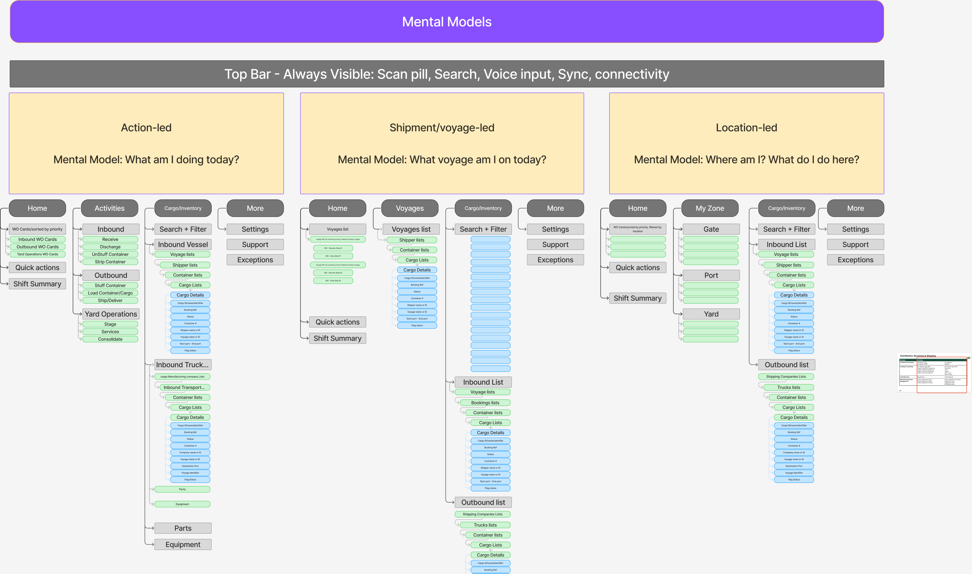
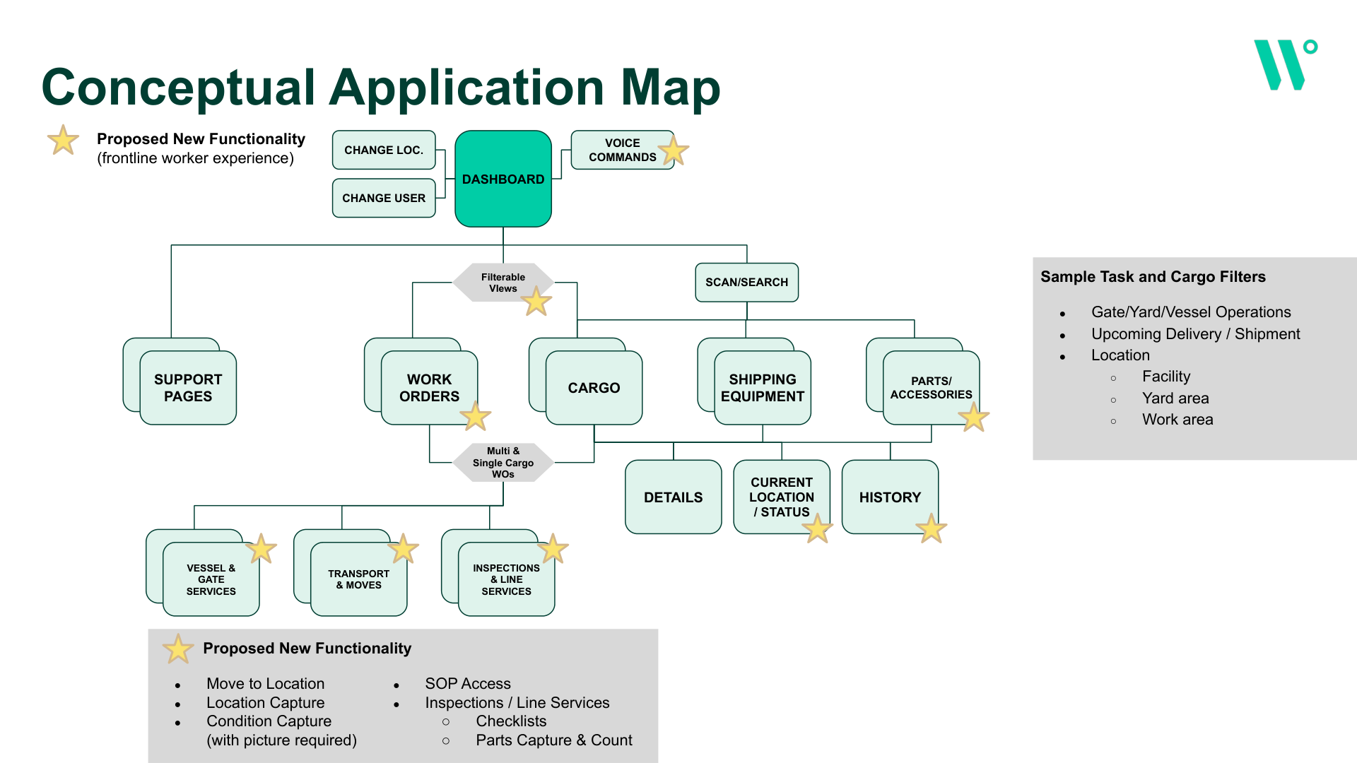
Converged into a 4-tab model (Home, Activities, Cargo, More) spanning 6 workflow domains, then matched against real workflow diagrams to correct statuses and terminology.
OOUX separates the system's nouns (objects) from its verbs (actions) — so navigation reflects what the system actually manages, not just a list of tasks. This model became the requirements documentation the development team used directly for API design — a direct hand-off from design into engineering, not a wireframe thrown over a wall.
The audit findings, designed for directly.
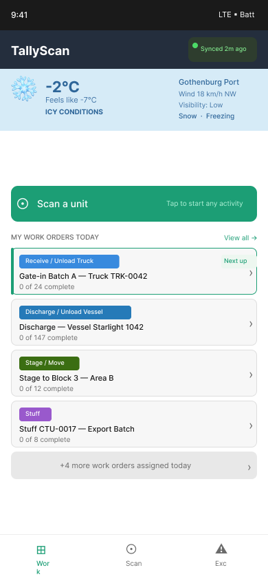
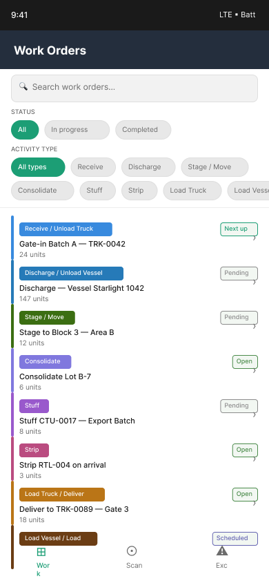
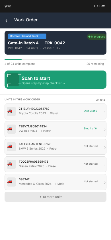
The concept addresses the audit's top findings by name: a synced-status indicator on the dashboard, location capture (Area · Block · Row · Space) and a condition check built into the work-order flow, and an activity-led home screen that surfaces today's work instead of requiring a search.
| Decision | Rationale |
|---|---|
| Cargo as the core object, not the shipment | The shift from shipping-first to cargo-first is behind most of the gaps identified — work orders, condition, and location all need a home on the cargo object itself. |
| Activity-led navigation, not cargo-search-first | Task frequency analysis showed handlers start their shift with a work queue, not a cargo lookup — so the entry point had to match the real first action of a shift. |
| OOUX before any screen design | Separating objects from actions in the mental model first prevented the redesign from inheriting the legacy navigation's conceptual confusion. |
| Location and condition capture, not exception-only | Condition and location are process deviations and damage are different records — folding both into standard steps instead of relying on the optional Raise Exception flow. |
| Remove the global off-switch on the receive flow | A quality step that can be switched off won't be relied on. Skipping a step becomes an exception with a reason, not a silent gap in the record. |
| Predefined exception reasons, not free text | Free-text input allowed garbage entries and produced inconsistent, unauditable exception data. |
Pilot-bound, not yet launched — stated plainly.
The pilot is targeting a September 2026 launch, so there's no post-launch usage data yet — that's said outright here rather than implied. But the IA itself is not a first draft treated as final: it went through three full versions, each revised against real taxonomy and workflow changes surfaced by the client team, not just internal design review. That's where the iteration happened before a single pilot user touched the concept.
Every screen scored for severity: observation, minor, moderate, major.
Beyond individual usability issues — each with a stated recommendation.
What is verifiable now: the audit and gap analysis directly shaped a working redesign concept, and the object-model requirements are already informing how the development team plans API design for the next phase. Usability testing of the redesigned concept itself hasn't happened yet — that's next, not done.