Re-architecting a support center millions of people rely on.
Quantum Fiber is Lumen's internet, phone, and TV service provider. Even though the support page had plenty of info and articles, it still had a high bounce rate across sections and lacked topics users needed — so the IA needed real research behind it, not another content pass.
- The current support page has lots of info and articles that help users, but still has a high bounce rate to a lot of its sections, and lacks some important topics users might be looking for.
- The support page needs user research and testing to make sure it has the best IA to match the user journey.
- The UI isn't intuitive enough to help users understand what topics are listed under each category.
Increase in the support center's helpfulness rating following the IA and content re-architecture.
Reduction in customers escalating from self-serve support into live chat.
Improvement on the Usability Metric for User Experience — a validated usability questionnaire.
Plus improved customer feedback overall.
Six phases, research-led throughout.
Research
Initial problem statement, data gathering, competitive analysis, card sort, tree test & user tasks.
Problem
Analysis, business opportunity, success criteria, hypothesis.
Ideation
Brainstorming, building the new IA, quick wins, working within dev tool limitations.
Solution
Lo-fi and hi-fi prototypes.
Usability tests
Usability testing for hi-fi prototypes.
Dev hand-off
Dev hand-off and QA.
User problem
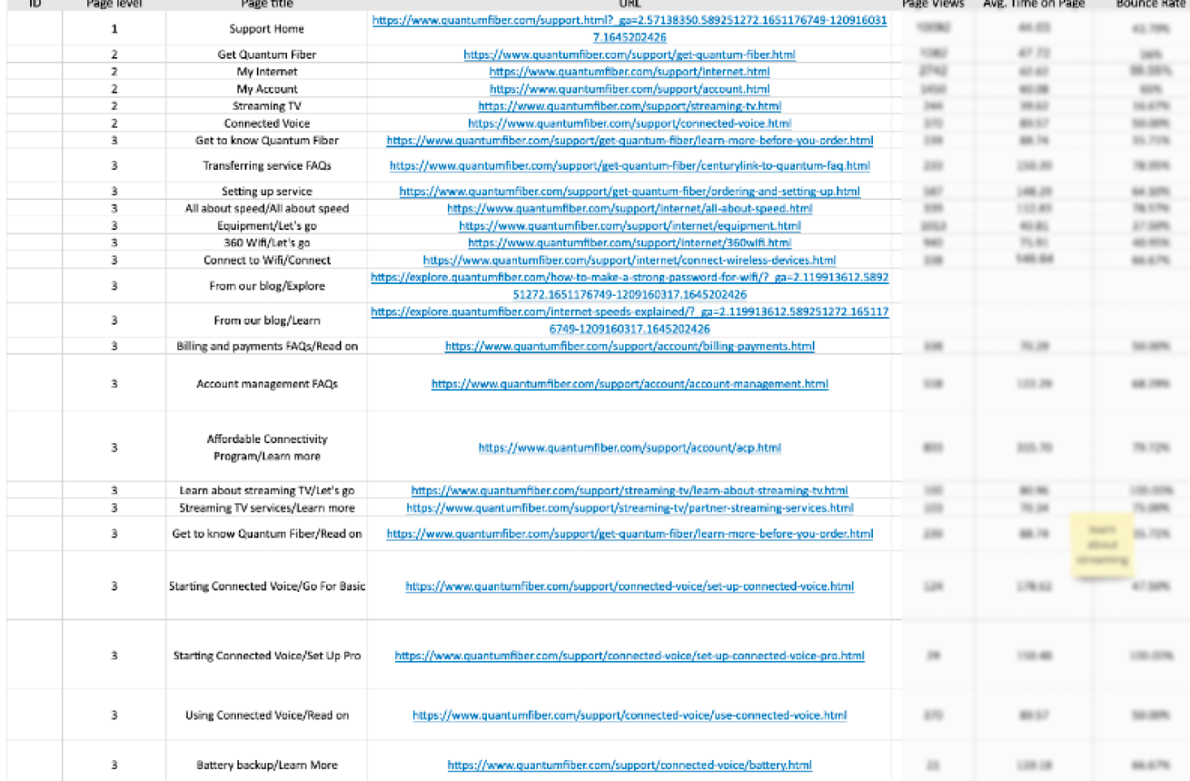
Exact page-view, time-on-page, bounce-rate, and exit figures are kept private — the structure of the inventory is what mattered for this process.
Compared the support center against three other ISPs — Spectrum, Xfinity, and Cox — to understand where Quantum Fiber's support page stood in the market and identify strengths, weaknesses, and opportunities to set it apart.
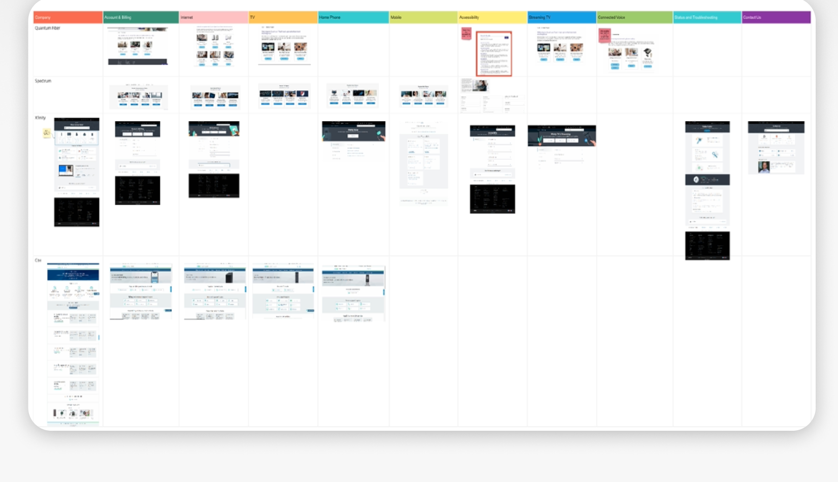
- UI of category content. A competing company's UI surfaces the content of each category directly, rather than hiding it behind another click.
- FAQ placement. Some competitors keep FAQs in the same spot on every screen, while Quantum Fiber placed them inconsistently across different visual treatments.
- Accessibility. Quantum Fiber lacked dedicated accessibility content that competitors had.
- Troubleshooting. People expect to find diagnostics tools and outage updates in support content — a gap in the existing page.
- Related topics needed an update.
- Search bar speed was very slow retrieving results.
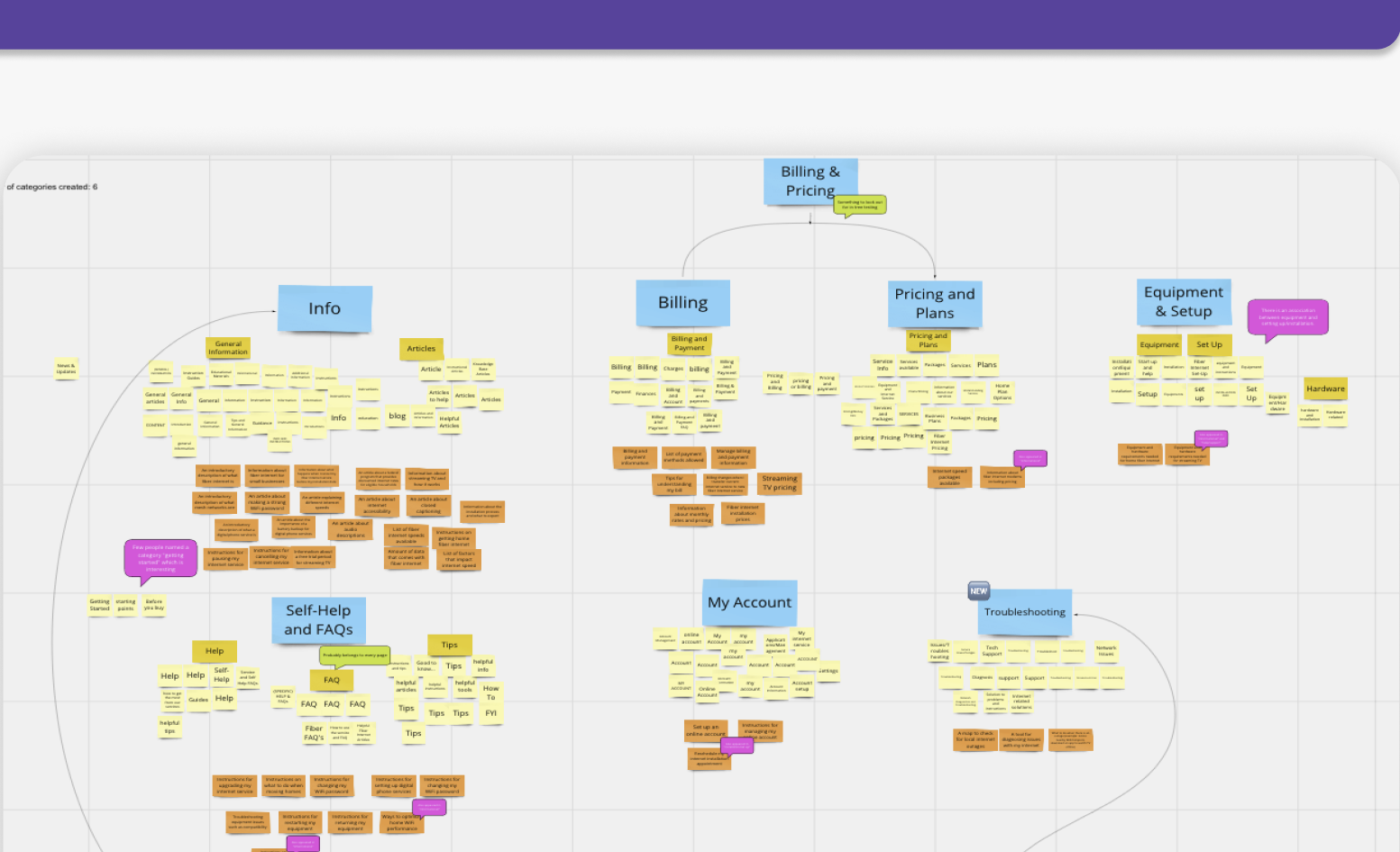
Goal: reveal how users categorize and organize support content, and how they label categories.
Results: average of 6 categories created per participant.
- Information
- Billing & Pricing
- Equipment
- FAQs
- Account
- Troubleshooting
- Billing, payment, pricing, plans
- Equipment, setup
- FAQs, self-help, tips
Goal: test the hierarchical structure of the proposed sitemaps built from the card-sort results, to gain confidence in the categories and labels created.
User tasks (drawn from chat intents, content inventory, and top-searched topics):
- Find info on fixing a connectivity issue with your internet service.
- Update billing and payment information.
- Reschedule an installation appointment.
- Cancel internet service.
- Learn more about internet speeds.
- Find out if Quantum Fiber offers streaming TV services.
- Learn about accessibility options.
- Learn about hardware — modems and routers.
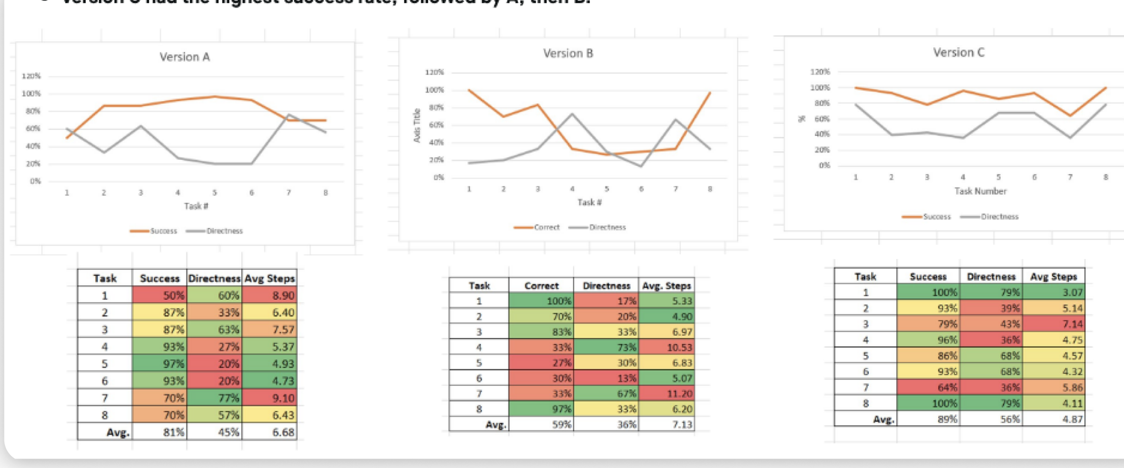
81% average success, 45% directness, 6.68 average steps to complete a task.
59% average success, 36% directness, 7.13 average steps.
89% average success, 56% directness, 4.87 average steps — the winner.
Version C — the widest, shallowest tree — had the highest success rate, followed by A, then B. Task 7 (finding accessibility information) was the hardest to find across every version; participants generally misread "accessibility" as compatibility or the act of getting internet.
A deeper tree consistently produced more unsuccessful searches, regardless of version — confirming that width beats depth for findability.
- Give people a robust search feature.
- Give people multiple ways of finding information — customers benefit from having the same content reachable more than one way.
- Implement a wider tree instead of a longer one.
- Examine whether some tasks are inherently more complex — accessibility, for example, may deserve its own category.
- Add quick links to the top tasks.
Business opportunity
- Move to an all-digital model.
- Self-management and install:
- Make instruction guides easily and quickly available on the support page.
- Make service-appointment management guides easily and quickly available.
- Make cancellation instructions available, but not easy — encourage a conversation with retention first.
- Troubleshooting:
- Add a speed-test tool, or link to one if not technically possible.
- Make troubleshooting guides quickly and easily available.
- Reduce calls to the help center.
- Reduce chat intents by 10% for the top topics — internet problems, payments, order reschedules, tech-visit status, cancellations, billing inquiries, appointment reschedules, internet speed and changes, service transfers, and missed technicians.
- Reduce search-bar volume for top topics by 10%, once more data is gathered.
- Reduce the bounce rate for the top tasks by 10%.
...and add more content to it, we ensure the customer is fully supported, and it helps move toward the all-digital model.
...we make sure the support page's content matches what customers are actually looking for, reducing calls to the support center.
...we target a wider range of customers who weren't served by the page before.
...we decrease the bounce rate and make it faster for users to find what they're looking for.
Whiteboarding a new IA, then two redesigns inside real constraints.
Following the card-sort and tree-test recommendations, the new IA was whiteboarded around the categories that tested best: Equipment, Services, Account & Service Management, and Speed & Troubleshooting — each broken down into subcategories and specific FAQs.
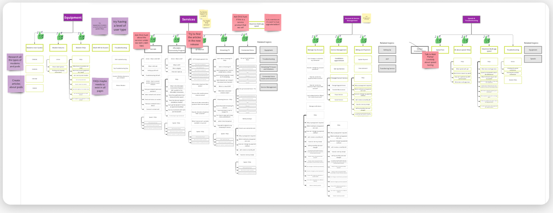
Quick wins were intentionally kept in smaller text and graphics in the original deck — ethically, the goal wasn't to spotlight UI issues with the current live site.
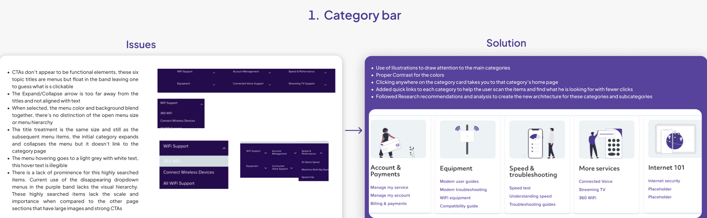
The six category titles read as static labels, not menus — nothing signaled they were clickable, the expand/collapse arrow sat far from the title, and hover states were nearly illegible. Rebuilt as illustrated cards with proper contrast: clicking anywhere on the card opens that category's home page, and quick links were added underneath so people could scan straight to the item they wanted.

Usability testing showed these were overlooked and skipped by most users — an unorganized wall of links next to an image unrelated to the content, with the sign-in CTA mixed in. Rebuilt as six high-contrast icon cards (Cancel Service, Fix Internet Problem, Set up Devices, Update Payment Method, Change Appointment, View Billing Statements), chosen using the top actual chat intents rather than a guess, with the sign-in CTA removed to its own section.
- Recreating a component that doesn't already exist is a hard, lengthy process.
- The CMS enforces a 24-column grid — challenging to reconcile with the category count the research actually recommended.
- The rigid grid meant limited flexibility to set the most suitable width for each component, and the same applied to spacing.
- Getting confirmation to move forward with the category and common-solutions card designs took a long process.
- Shadow-setting limitations in the CMS.
- Constant follow-up with developers was needed about implementation details.
A landing page plus a scalable template system.
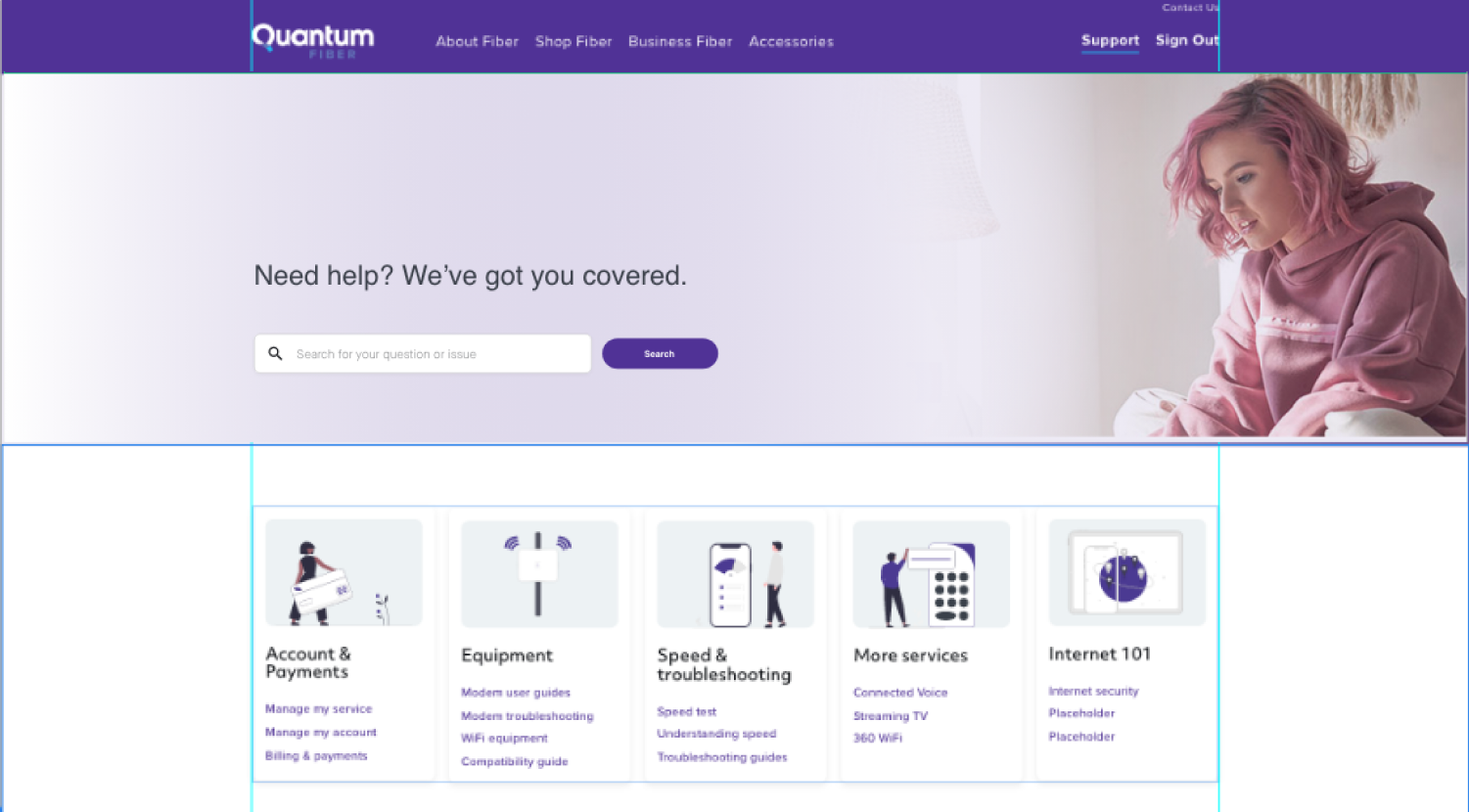
The shipped landing page (shown at the top of this page) pairs a search-first hero with the redesigned category cards and a Common Solutions module for the most-requested tasks. Below it, three reusable templates — Level 1, Level 2, and Level 3 — let 40+ support topics scale without one-off page designs, all built to the Nucleus design system Lumen's developers already used.
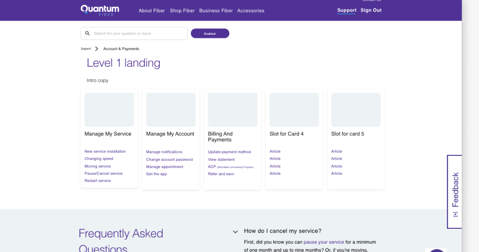
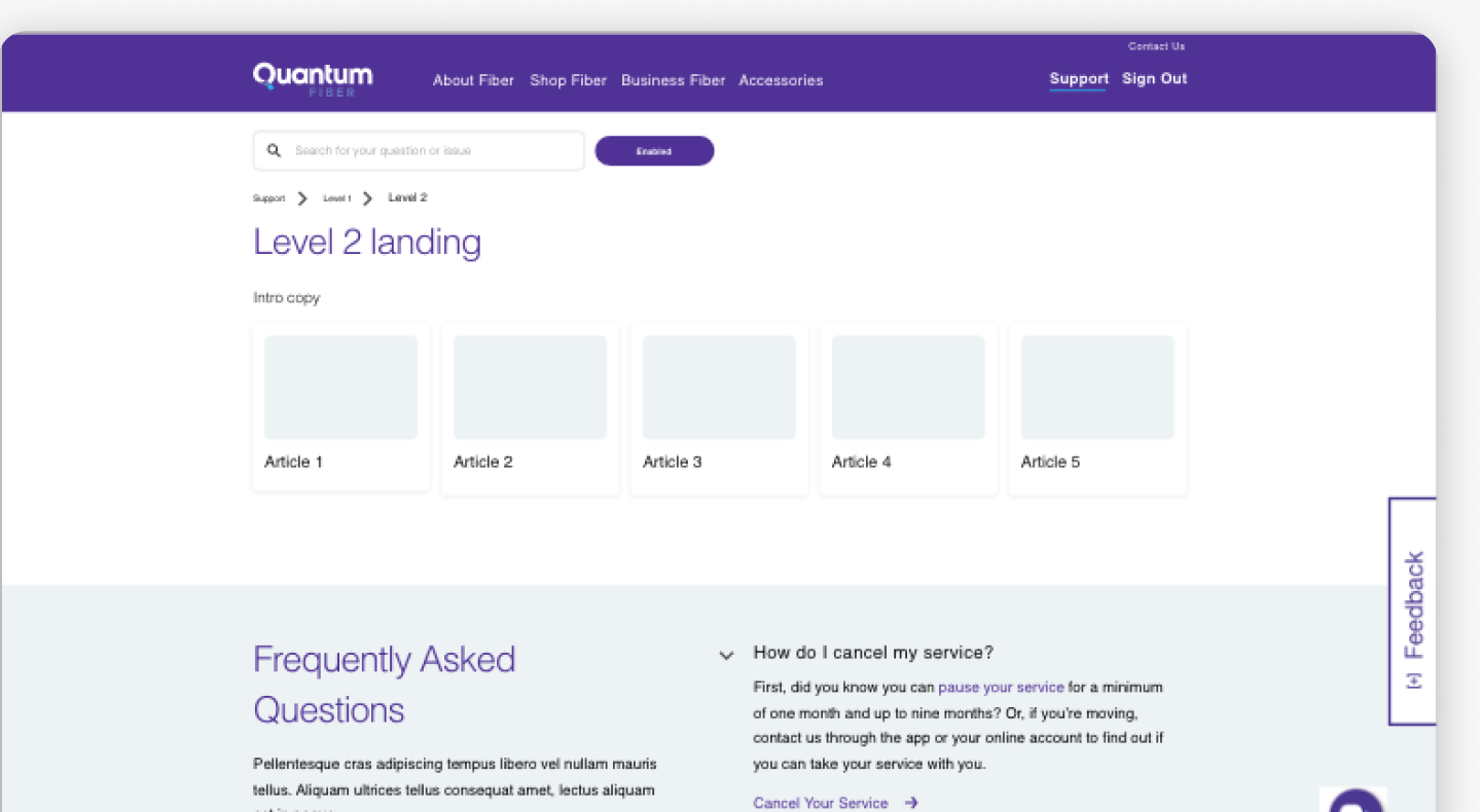
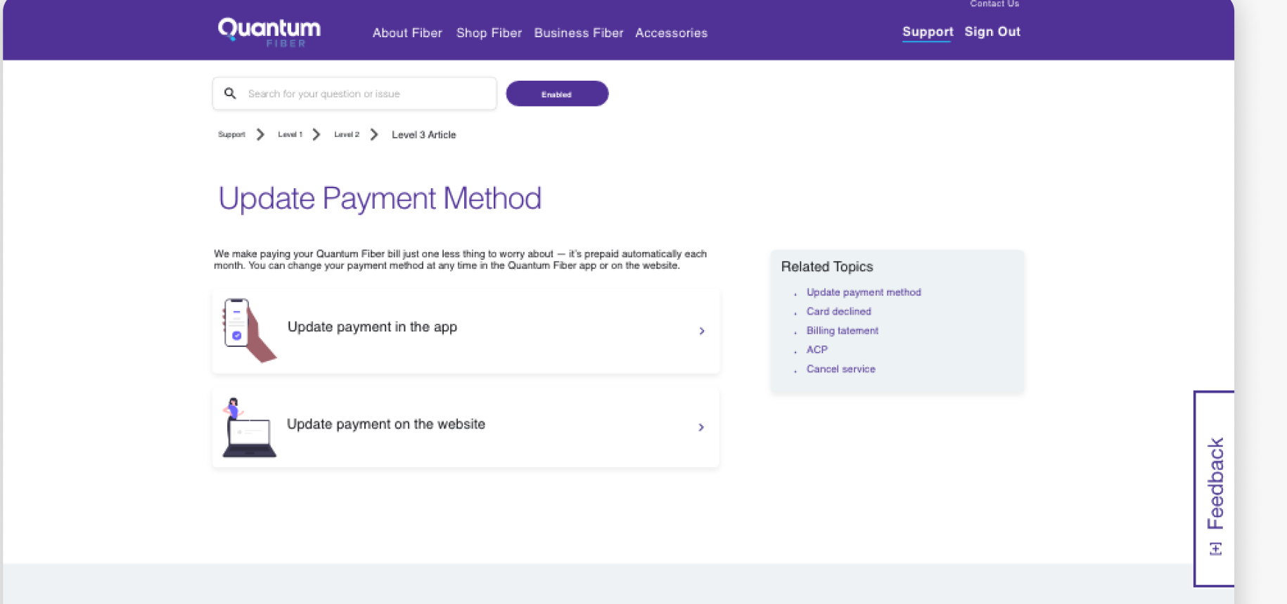
40 illustration placeholders were built for this system, and the Nucleus design guidelines were made available online for the dev team.
What broke, before it shipped broken.
Tested hi-fi prototypes through composite and single-task sessions via UserTesting.com, scored for success, directness, and SUS (System Usability Scale) per task.
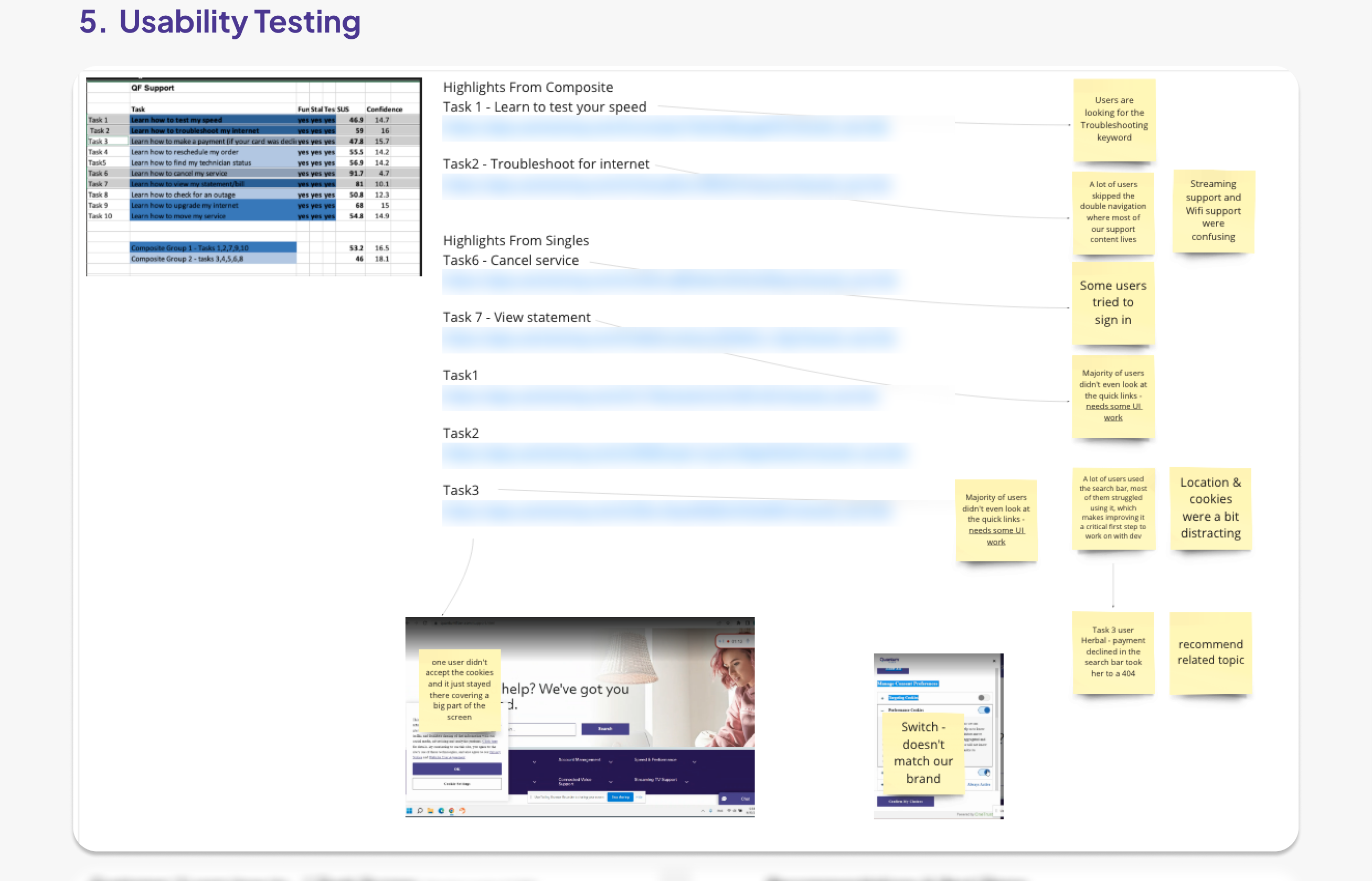
Session-recording links from UserTesting.com are blurred — only the scored results, sticky-note findings, and screenshots are shown.
Several users skipped the category dropdown entirely and went straight to search — most looking specifically for the word "Troubleshooting." Streaming and WiFi support were also a common source of confusion.
Even after the redesign, a majority of users still didn't look at the quick links first — confirming placement, not just styling, needed more work.
The search bar was slow to return results, and a cookie-consent banner sometimes covered a large part of the screen — one user never accepted it, and it just stayed there.
Some users tried to sign in from the support page itself. A declined-card payment scenario routed a user to a 404 instead of a recovery path. A toggle switch's color didn't match the brand.
Tracked to done, not just designed.
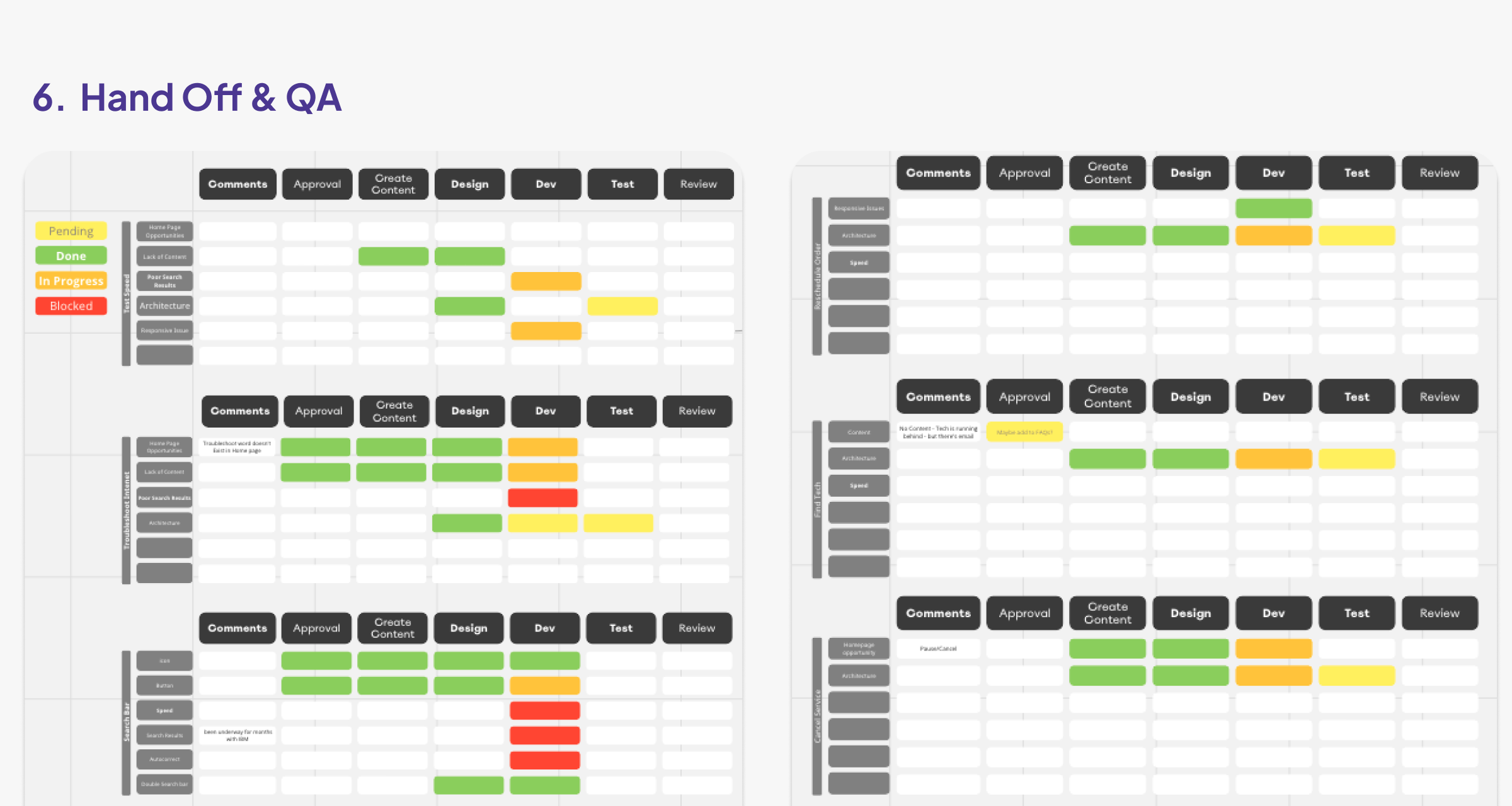
Every workstream — Search Bar, Make Payment, Cancel Service, Find Tech, View Statement, homepage opportunities, and architecture changes — was tracked through the same pipeline: Comments → Approval → Create Content → Design → Dev → Test → Review, so nothing shipped without a clear owner at each stage.
The three outcome metrics are unusual in UX work because they're independently attributable to the same redesign: fewer people needed to escalate to a live agent (−20% chat intents), the people who used self-serve found it more helpful (+10%), and the instrument built specifically to measure usability moved substantially (+24 UMUX points). Customer feedback improved alongside all three.
What the research flagged for the next round.
Although the redesign achieved the company and user outcomes it set out to, the research surfaced several areas worth further investment: