Thirteen tools to get paid. One place to see how you're doing.
PEAK — Performance Engagement Applications and KPIs — is the UX strategy for unifying the tools frontline agents, retail reps, and supervisors use to track commissions, incentives, goals, and coaching. It started with a day-in-the-life research deck and ended with a vision, a set of goals, and a five-phase plan to get there.

> Internal system, tool, and platform names generalized for public portfolio use.
Empathy → Define → Ideate → Prototype → Test & iterate.
Empathy
Interviews with supervisors across two divisions, a full-day store visit, and a survey of roughly 280 employees — turned into tool maps and four journey maps.
Define
Distilled what people said into a set of pain points, each paired with a direction to solve it, and six goals for the program.
Ideate
Framed the vision and weighed five ways to phase it, with the pros and cons of each, against what the survey and interviews said people wanted.
Prototype
Showed the destination: a future-state PEAK experience, told as a day-in-the-life story from a frontline employee's point of view.
Test & iterate
Named what was still unvalidated, and set out the research, KPIs, and technology questions for the next round.
The problem: nobody could tell if they'd been paid correctly.
Sales agents, retail reps, and their supervisors each used a different mix of internal tools to place orders, check order status, track performance, calculate commissions, and get coaching — with a shared spreadsheet quietly holding the whole thing together. The starting question for the deck was simple: what does a normal day actually look like for the people managing commissions, and where does it hurt?
- Kickoff with stakeholders to set scope and questions.
- Virtual one-on-one interviews with three supervisors — two from the national division, one from the central division.
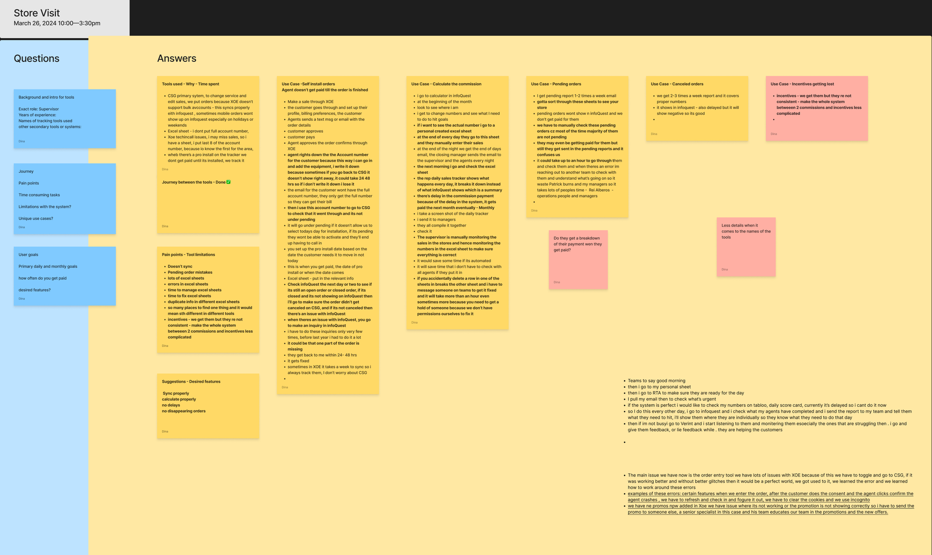
- Store visit (10:00 to 3:30) with a supervisor and an agent, shadowing real self-install orders, commission checks, and pending-order clean-up.
- Quantitative survey of frontline agents (150), supervisors (62), and retail sales staff (68), later paired with a round of interview synthesis.
The first deck was explicit about its limits on every slide: everything in it came from initial interviews, and further research was required to validate it.
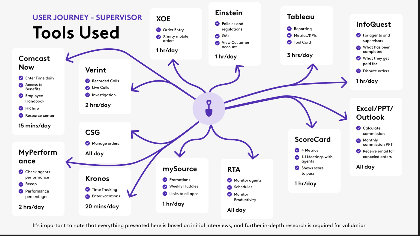
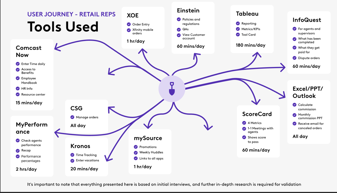
Mapping the tools each role touches showed how fragmented a day really is. A supervisor opens tools for order entry, order status, policy and account lookup, call monitoring, reporting and scorecards, performance tracking, time entry, promotions and huddles, and — all day — spreadsheets, presentations, and email for calculating commissions. Retail reps use largely the same set, with reporting and order-status checks taking a large share of their time.
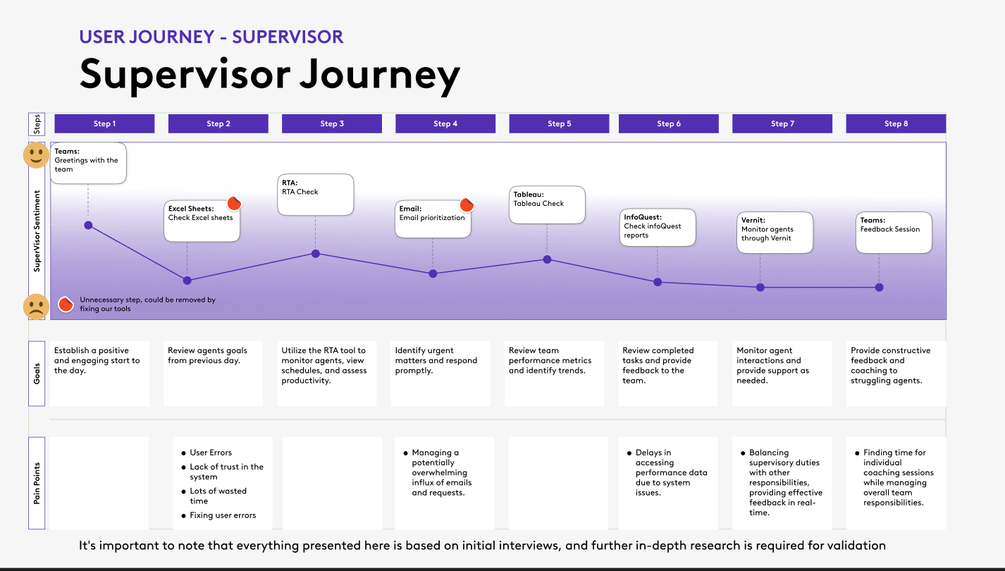
Each journey is drawn as a sentiment line across the steps of a day, with the goal and the pain points at every step, and a red marker on each step that only exists because the tools don't work together.
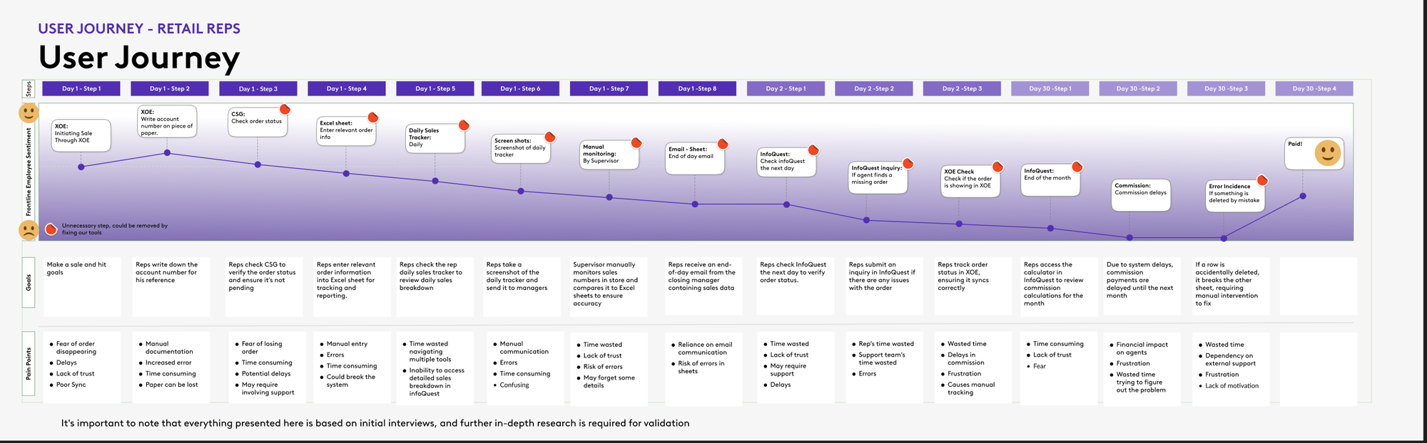
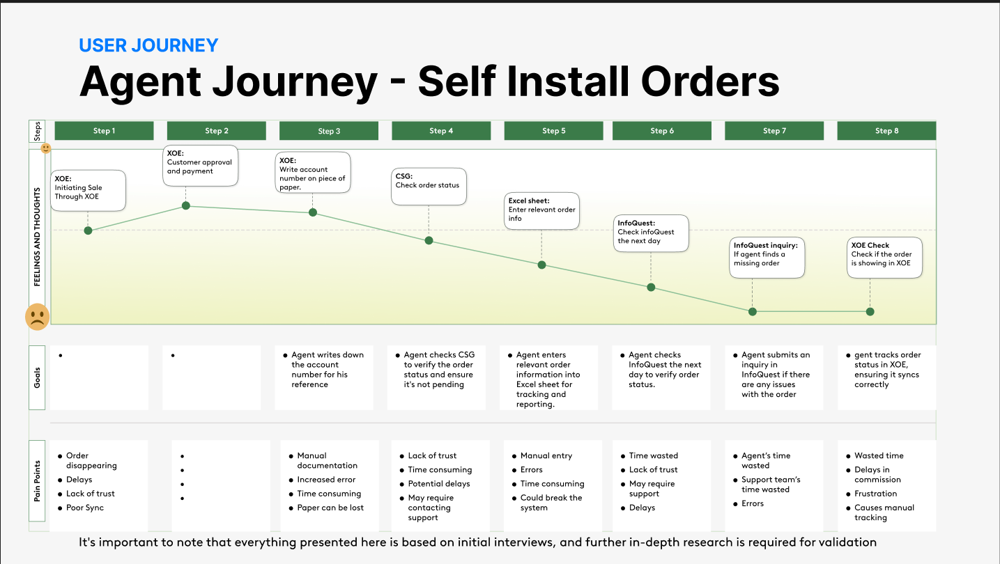
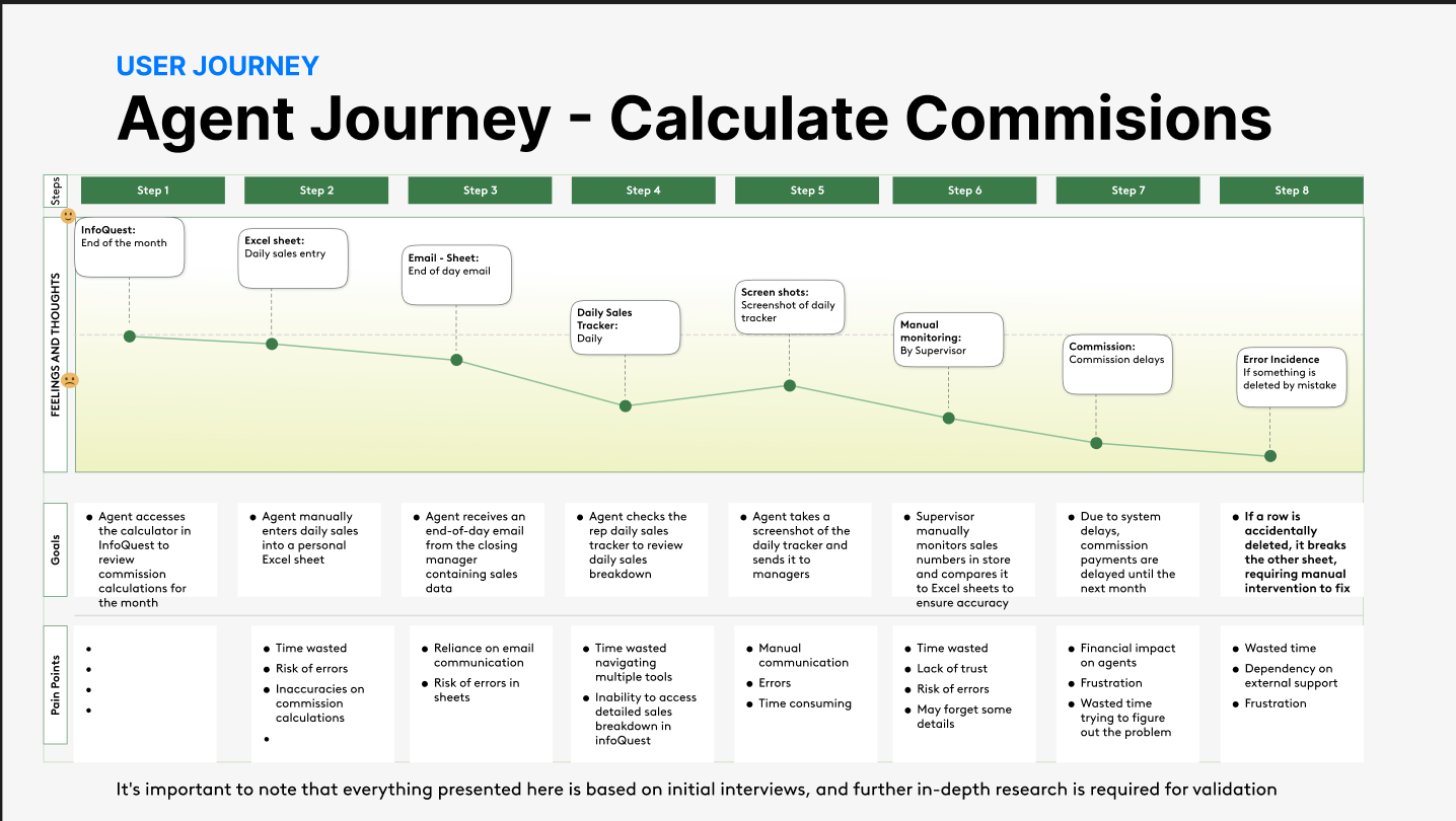
The store visit turned the maps into stories. An agent finishing a self-install order writes the customer's account number on a piece of paper, because the order can take 24 to 48 hours to appear in the order-status system and they'd otherwise lose it. Agents don't get paid until an install completes, so they track every open order themselves in a spreadsheet. A supervisor reviews pending orders by hand, up to an hour at a time, because most of them turn out not to be pending at all. And one accidentally deleted row can break a linked sheet and take more than an hour — and someone with permissions — to fix.
Five ways the toolset was costing the business.
Across the interviews, the store visit, and the journeys, the same problems kept showing up. The findings deck summarized them under existing challenges: tools that are complex and hard to manage, multiple tools that duplicate information, time wasted managing and fixing sheets, delays and mistakes in pending orders, and incentive and payment problems. Its "impact on the business" slide translated them into terms leadership cares about:
- Decreased productivity: time spent navigating tools and spreadsheets is time not spent selling.
- Increased errors: multiple tools and manual processes make wrong commission numbers more likely, which frustrates and demotivates.
- High turnover: inefficient tools that hinder tracking commissions lower job satisfaction.
- Negative customer feedback: when agents are busy with admin, they have less energy for the customer.
- Missed opportunities: hard-to-track performance means hard-to-improve performance.
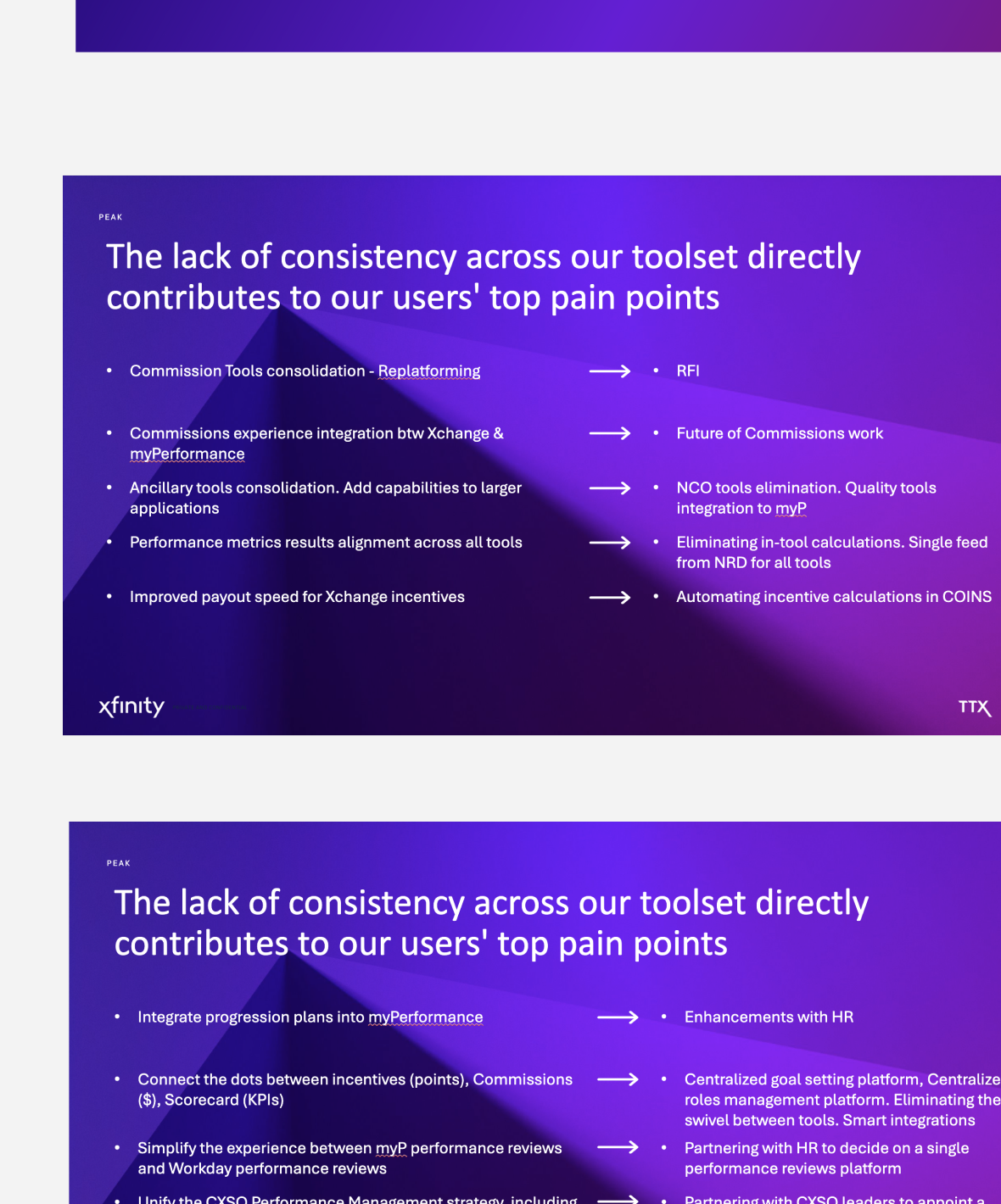
A second deck took each pain point and paired it with the direction that would solve it, so no problem was left as an observation with nowhere to go.
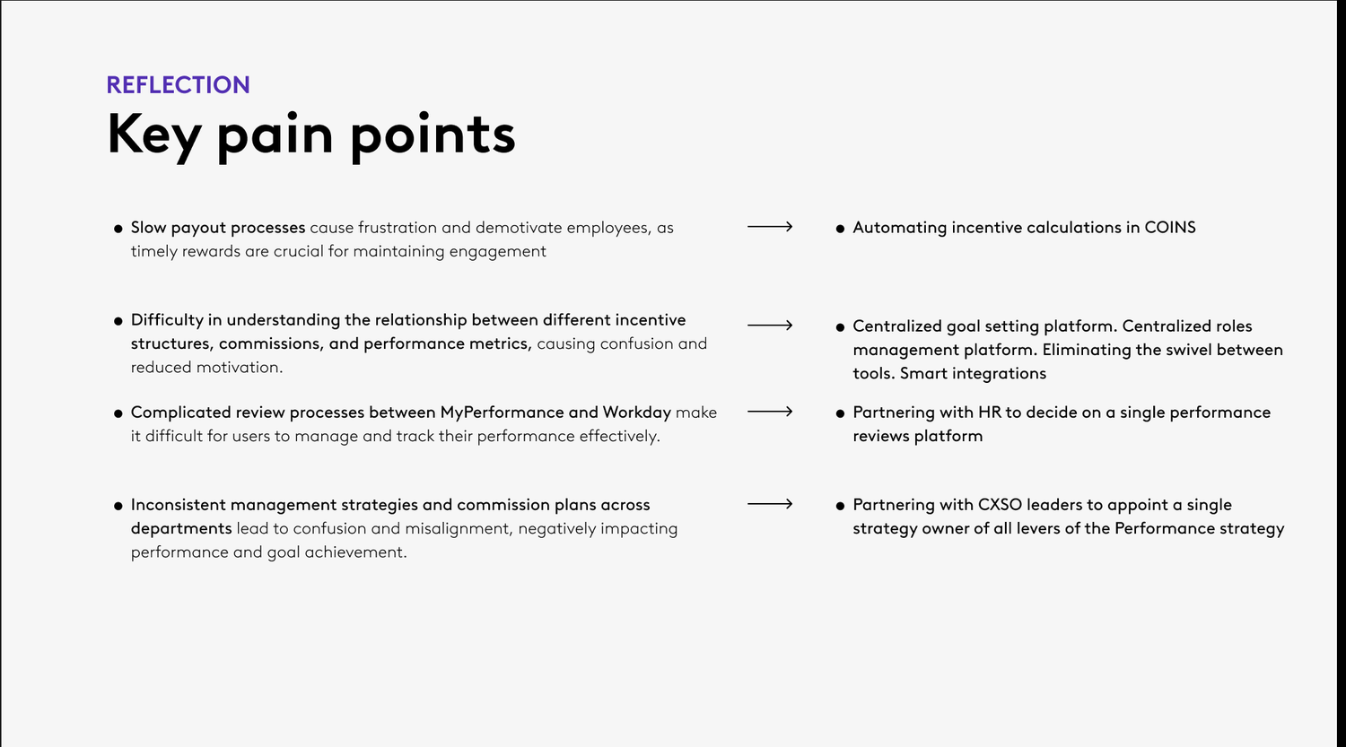
| Pain point | Direction |
|---|---|
| Data inconsistencies across tools | A dedicated future-of-commissions effort, with performance metrics aligned across every tool from a single feed. |
| Progression plans not connected to the performance tool | Work with HR to bring progression plans into the same place. |
| Slow payouts | Automate incentive calculations at the source, instead of in each tool. |
| Hard to see how incentives, commissions, and metrics relate | A centralized goal-setting platform and roles management; eliminate the swivel between tools with smart integrations. |
| Complicated review process across two systems | Partner with HR to choose a single performance-review platform. |
| Inconsistent strategies and commission plans across departments | Appoint a single strategy owner for every lever of the performance strategy. |
| Overcomplicated interfaces | Retire redundant tools and integrate quality ones into the main performance experience. |
| Fixing errors in spreadsheets | Fix the underlying tools so the spreadsheet stops being the system of record. |
The program's goals came straight from the pain points: easy access, accurate metrics, on-time payments, real-time sync, high user trust, and fewer errors.
A vision, and five ways to phase it.
The UX strategy is framed as three steps — vision, goals, plan — and the vision is one sentence: create a unified experience across the performance tool and the employee workspace, giving employees and their leaders seamless ways to manage commissions, incentives, and coaching, so that these processes are streamlined, the experience improves, and productivity rises.
A quantitative survey and a round of interviews gave the phasing decisions evidence to lean on:
- Top asks for improvement: more frequent, real-time data (the most-mentioned request), better navigation, better integration with other tools, and a simpler, less cluttered layout.
- Who uses what: frontline agents use the performance and commission tools most often; supervisors use the rewards-and-recognition tool most and spend the longest per task; retail staff use the commission tool least.
- Experience matters: longer-tenured employees use the tools more and finish tasks faster, and higher self-reported commission knowledge means more frequent use.
- Combine, but not everything: interviewees generally agreed that the performance tool and the commission tool should become one platform, while the rewards-and-recognition tool was seen as a standalone — one that should stay separate but be reachable from the new one.
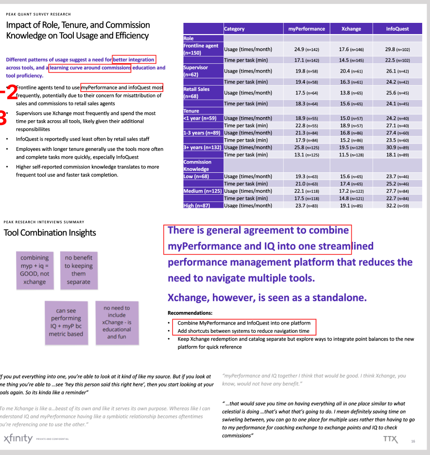
Marked "private and confidential" in the source; shown here only behind the password.
Five phases, each with its risk on the table.
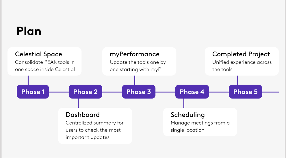
The plan brings the tools together in stages, so users get value early without waiting for a full rebuild:
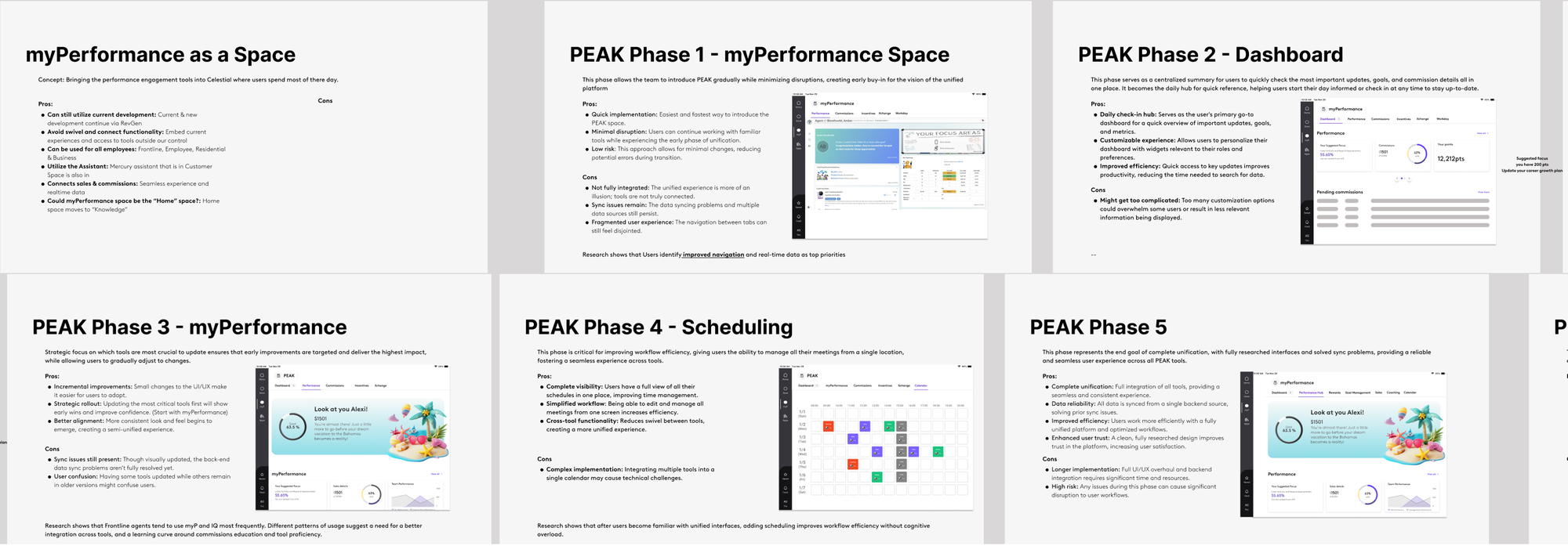
- Phase 1 — a dedicated performance space inside the employee workspace, where people already spend their day. The fastest and lowest-risk way to introduce PEAK, but the tools are only visually unified, so sync problems remain.
- Phase 2 — a dashboard: one daily check-in hub with the most important updates, goals, and commission details. Risk: too many customization options could overwhelm.
- Phase 3 — update the tools one by one, starting with the most-used ones, so improvements land early. Risk: users see mixed old and new versions in the meantime.
- Phase 4 — scheduling: manage every meeting from a single calendar, ending the swivel between tools. The hardest phase technically.
- Phase 5 — complete unification: every tool on one backend with one consistent design, solving the sync problems for good. Longest and highest-risk, since problems here disrupt everyone.
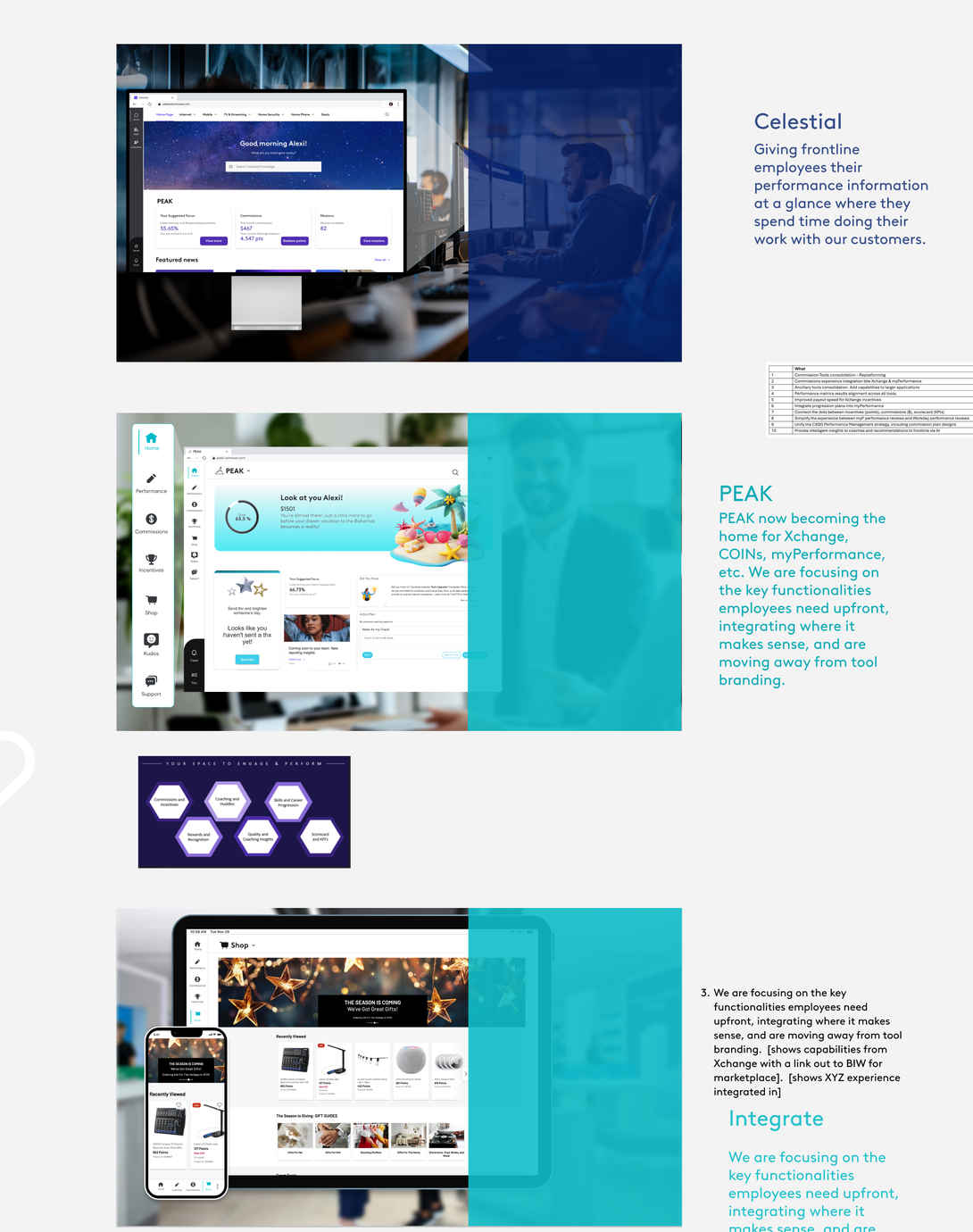
To make the future concrete for stakeholders, the vision is told as a short day-in-the-life story from a frontline employee's point of view: as I start the day, they see performance information relevant to their role at a glance on the employee homepage; when I go to PEAK, they see recent coaching, leaderboards, and missions in one place, with the key capabilities of the old tools integrated where they make sense — and no tool branding in sight. If something in the data looks wrong, they can open a case right there. A conversational assistant is proposed as a coach, making recommendations at the right time.
Unvalidated, stated plainly — and what comes next.
The first deck was upfront that its findings came from initial interviews and needed further validation, and the second round tested that with a survey and interview synthesis. This is a strategy and phasing plan; it isn't a shipped product, and this page makes no claims about usage or outcomes. What the research asked for next:
- More user research: how many employees are affected, validating the challenges, more journeys and personas, and quantifying tool usage.
- KPIs for evaluation: turnover rates, customer feedback, error tracking, and potential revenue loss.
- Technology solutions: quick fixes that produce quick wins in the current tools, and a clear view of the technology challenges.
Each with pros, cons, and the research behind it.
Easy access, accurate metrics, on-time payments, real-time sync, high trust, fewer errors.